On Air Now
Gold Radio Through the Night 12am - 4am
20 March 2023, 12:30 | Updated: 10 January 2024, 12:38
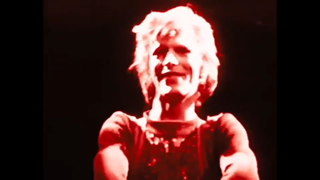
David Bowie - Moonage Daydream movie full length trailer
How a logo designed for just one David Bowie album became his enduring symbol.
If you ask someone to draw "David Bowie's symbol" they'll know exactly what you mean.
With a few pencil strokes anyone at all can give a fair attempt at that immortal lightning bolt and everyone will immediately recognise it.
But David Bowie was never one to hold on to a musical style, aesthetic, pair of shoes, hairstyle, typeset or symbol for any length of time.
So unlike The Rolling Stones' cheeky tongue and lips logo which swiftly became their official stamp on all their records, stage sets and merchandise, Bowie jettisoned the lightning bolt almost as quickly as he slathered it on his face.
The thing is, it was just too powerful an image to fade away into history, and over the year, and especially since his death in January 2016, it has become his de facto symbol. Here's the fascinating story of the lightning flash.

The story of David Bowie's lightning bolt isn't nearly as convoluted and controversial as The Rolling Stones' Hot Lips.
The idea came from David Bowie himself, it was designed by groundbreaking photographer Brian Duffy – who shot the image – and it was physically applied to Bowie's face by makeup designer Pierre Laroche.
Quoted in Aladdin Sane 50, Duffy recalled years later: "I don't remember having too many preconceived ideas before the actual session, but I remember that it was David who suggested and was talking about the possibility of using a lightning flash.
"That is 100%. We were drawing lightning bolts, not necessarily over his face, but across his torso, similar to how the inner sleeve looked."
Duffy's son Chris – a teenager at the time who was present during the session – added: "David always had this flash element idea from the beginning.
"I think what made David and Duffy work so well was the fact that David knew he could throw something abstract like that at Duffy and Duffy would interpret it and come up with something brilliant."

David Bowie/Aladdin Sane Tribute Makeup Tutorial
Duffy's studio manager Francis Newman said: "Pierre started to apply this tiny little flash on his face. And when Diuffy saw it, he said, 'No, not f**king like that. Like this' and literally drew it right across his face and said to Pierre, 'Now fill that in.'
"It was actually Duffy who did the initial shape – I'm not saying he did the actual make-up. It then took Pierre about an hour to apply properly. The red flash is so shiny because it was actually lipstick."
Sometimes called the "flash", when asked what it actually was, Bowie told Rolling Stone in 1987: “Lightning bolt. An electric kind of thing.
"Instead of, like, the flame of a lamp, I thought he would probably be cracked by lightning. Sort of an obvious-type thing, as he was sort of an electric boy."

The first and only time David Bowie has ever worn the lightning bolt logo on his face was for the photoshoot for his 1973 album Aladdin Sane.
The photograph was shot at Duffy's own Primrose Hill, London studio in January 1973. That was only seven months after the release of Bowie's breakthrough The Rise and Fall of Ziggy Stardust and the Spiders from Mars.
It was six months before Bowie's final Ziggy show at the Hammersmith Apollo. But pop moved fast in the early 1970s and David Bowie moved even faster.
The image was unleashed to the public with the release of the 'Drive-In Saturday' single (backed with 'Round and Round'), which was in shops on April 6, 1973.
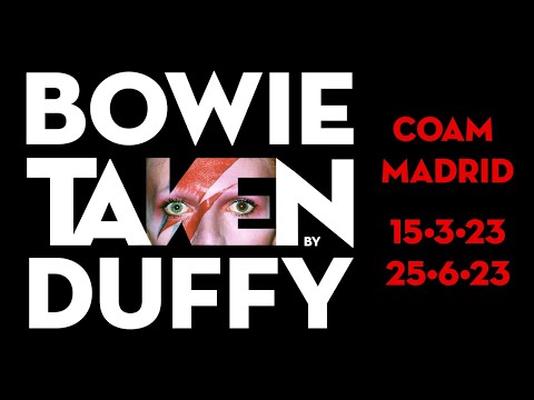
Bowie Taken by Duffy - COAM Madrid - March 2023
The photo used for the cheap single sleeve was a close-up in muted red and blue, but it was a couple of weeks later on April 20, 1973, that we got to see the lightning bolt logo in its full glory on the front of the Aladdin Sane album.
It has a shirtless David Bowie (swoon), with his hair dyed orangey-red and that lightning bolt right down his face.
The oversized shimmering teardrop on his clavicle was one of Duffy's last-minute ideas. "He put that on afterward, just popped it in there," Bowie remembered. "I thought it was rather sweet.”
The photo was shot with a Hasselblad EL500 on Ektachrome 120 film using a ring flash, and the finished image was airbrushed by Philip Castle.

The chosen image featured Bowie closed-eyed facing the lens. Other images from the shoot have since been used, with that open-eyed shot leading the V&A's David Bowie Is... exhibition (more on that later).
Bowie's then-manager Tony Defries was well known for his showbiz machinations, playing up his client as a much bigger star than he actually was in the belief – borne out by experience – that playing a superstar would help make him one.
So Defries insisted album cover was made using an eye-wateringly expensive seven-colour system instead of the usual four, apparently making it the most expensive cover art ever at the time.
Defries thought that if enough money was ploughed into the project, RCA would have no choice but to promote the hell out of it.
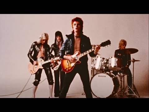
David Bowie - The Jean Genie [4K Upgrade]
"I was looking for an iconic cover image and artwork that would help me to persuade RCA that Bowie was sufficiently important to warrant megastar treatment and funding, in order to propel him to exactly that status,” Tony Defries said in the book Duffy/Bowie.
"Engaging a master, world-class photographer to shoot the product/brand and to design the artwork was the best way to send that message. Brian had the ability to make the mundane image interesting and the interesting image fascinating."
While Bowie was known to jettison his collaborators when he felt they were no longer useful, sometimes with indecent haste, he was clearly happy enough with the Aladdin Sane cover.
Laroche stayed on with Bowie for his 1973 tour and the witty Pin Ups cover shoot that featured a heavily made up Bowie and Twiggy, while Duffy went on to photograph the sleeves for 1979's Lodger and the following year's Scary Monsters (and Super Creeps).

As we've said, the idea for the logo came from David Bowie himself, and Duffy has suggested that the inspiration was Elvis Presley's chunky ring, which featured a lightning flash and the letters TCB, which stood for Taking Care of Business.
It's also been claimed that the packaging of a Panasonic rice cooker that featured the company's then logo, designed in the 1930s, also fed into the brainstorming session between Bowie, Duffy and Laroche.
Duffy's studio manager Francis Newman said: "I wasn't actually party to the discussion about the flash on the face, so I can't say if it came off this rice cooker."

Bowie scholar Nicholas Pegg has also suggested that the flash may borrow from the lightning bolt that hits the Tower in the Tarot.
Beyond potentially borrowing a visual from Elvis, the lightning bolt has been widely interpreted as signifying Bowie's mixed feelings about superstardom after breaking through with Ziggy Stardust, as well as the apparent split personality of the Aladdin Sane character.
Bowie had introduced the concept as early as January 1973, telling Russell Harty "My next role will be a person called Aladdin Sane" just days before finishing the recording sessions.
He added of the essentially 'Cracked Actor' figure that was Aladdin Sane: "Aladdin Sane was an extension of Ziggy on the one hand. On the other, it was a more subjective thing.
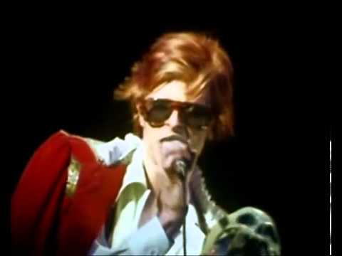
Trailer: Cracked Actor
"Here I was on this great tour circuit, not enjoying it very much. So inevitably my writing reflected that, this kind of schizophrenia that I was going through.
"Wanting to be up on stage performing my songs, but on the other hand not really wanting to be on those buses with all those strange people. Being basically a quiet person, it was hard to come to terms. So Aladdin Sane was split down the middle."
It's also been suggested by the Holden Luntz Gallery that the red and blue colours of the face-splitting lightning bolt are "in some way emblematic of the cultural split between the US and Britain".
That makes some sense, with Aladdin Sane being described by Bowie himself as "Ziggy goes to America".

Given how much it's endured, it's striking how little David Bowie used the lightning bolt logo after the Aladdin Sane album.
It didn't pop up on the singles after 'Drive-In Saturday' ('Time' and 'Let's Spend The Night Together'), and despite Pierre Laroche still being part of the team, Bowie didn't wear the bolt on his face during his live shows, and it wasn't there on the same year's Pin Ups cover album.
Bowie did use the bolt as backdrop during his 1973 tour, and a variation on the lightning bolt theme was there with the new Bowie logo on 1974's Diamond Dogs sleeve.

Then quick as an (ahem) flash, it was gone, with not even that logo popping up on the following year's David Live or 1976's Young Americans.
Not only won't you find it on any of his studio albums after that period, it didn't pop up on any of the live albums or – unless you count collages including the original Aladdin Sane sleeve – compilations released during his lifetime either.
The only other time we've seen it on an official David Bowie album release was the posthumous Legacy (The Very Best of David Bowie), which was released in November 2016, 10 months after David Bowie died, where the lightning bolt replaced the "I" in Bowie on the front.
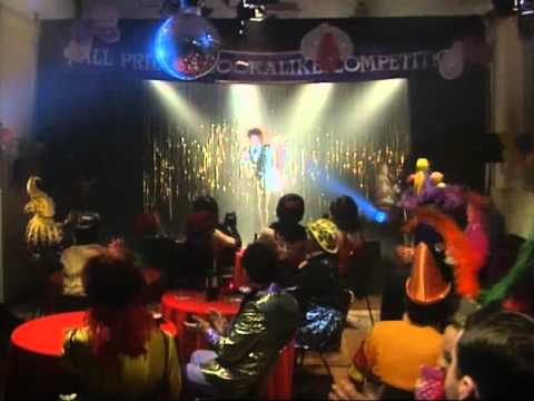
Father Ted Ziggy Played the Guitar
Unofficially though, the image quickly became aligned with and inseparable from Bowie.
Fans and impersonators have used the symbol for decades, and when Father Harry Coyle played 'Ziggy Stardust' in the All Priests Stars in Their Eyes Lookalike Competition in episode four of Father Ted, he had the lightning bolt emblazoned on his face.
When Bauhaus released their cover of 'Ziggy Stardust' as a single in 1982, their gloriously timey-wimey mashup sleeve featured the Aladdin Sane lightning bolt and more-recent Scary Monsters (and Super Creeps) typeface.
Bowie fan and friend Kate Moss sported that same red-and-blue bolt on her face when she fronted Vogue in 2003.

And when Bowie tragically died just days after his 69th birthday in 2016, fans congregated at a mural featuring the lightning bolt that was painted by street artist Jimmy C three years earlier in Brixton, where Bowie had been born and raised.
The lightning bolt was a key image in the stunning David Bowie Is... exhibition that opened at the Victoria and Albert Museum in March 2013 and later toured the world, and we're sure we'll see it all over the new museum that the V&A will open in Stratford in 2025.
A signed contract sheet from the original photoshoot was sold at Bonham's auction house for a whopping $20,000 in April 2022.

In spring 2023, COAM Madrid has been hosting an exhibition called Bowie taken by Duffy, exploring the collaborations between the two artists.
Naturally, it's that lightning bolt logo that's a major focus throughout.
And on the official David Bowie website, on press releases for re-releases, and especially in the David Bowie shop, you can't move for lightning bolts.
Not only does it use a version of that Diamond Dogs-era Lightning Bowie logo throughout, you can buy music, T-shirts, books, bags, stickers and much more besides featuring versions of the original.

What's more, the Bowie 75 logo consciously features a couple of those red-and-blue bolts.
“Duffy’s pictures of David are so iconic,” his son Chris told AnOther. "Eventually we have all got to pass on, but I would guess that David’s legacy will be the Aladdin Sane picture. It has become a cultural icon.
"Several years ago I started calling it the Mona Lisa of Pop. I think it is quite befitting – there isn't really an image that is as ubiquitous.
"It's been on used fridge magnets, caps, calendars, T-shirts, lighters, beer mats and it is quite extraordinary, you know? You can go somewhere like a market in Goa and you will find people selling rip-off Aladdin Sane T-shirts."