The Rolling Stones logo: Who designed the iconic tongue and lips image?
1 March 2023, 09:15 | Updated: 2 July 2024, 11:59

Watch the Rolling Stones SIXTY 2022 Tour Announcement
They didn't have it for their first decade, but the 'tongue and lips' logo has become inseparable from The Rolling Stones.
Listen to this article
Rock 'n' roll is full of classic imagery, arguably starting with those record label logos on 45s and albums – RCA, Liberty, Columbia, Parlophone, Sun, EMI and the rest.
Then came bespoke text for artists, like the drop-T Beatles typeface, The Monkees guitar and AC/DC lightning bolt, and maybe the most iconic of all is The Rolling Stones tongue and lips logo.
- '(I Can't Get No) Satisfaction' by The Rolling Stones: The making of the riff-tastic anthem
- The Beatles vs The Rolling Stones – in their own words
- How well do you know The Rolling Stones' song lyrics?
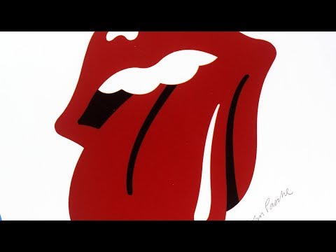
Also known as the lips and tongue logo, The Tongue, the Hot Lips logo, the Rolling Stones Records logo or just the Rolling Stones logo, it might well be the most recognisable image in music.
But when did the band start using the logo, who designed it, and how has it evolved over the years?
Here's everything you need to know about the in-yer-face The Rolling Stones tongue and lips logo.
When did the Rolling Stones start using the tongue and lips logo?

The Rolling Stones celebrate their 60th anniversary in 2022, but they haven't had their iconic logo quite as long as that.
In fact, the band's first two UK albums – The Rolling Stones and The Rolling Stones No.2 – didn't feature their band name or the album title at all. Nor did their fifth and sixth.
And even when their early releases did boast The Rolling Stones name on the front, they didn't use the same typeface across their albums.
That all changed in 1970, when The Rolling Stones were designing a poster for their 23-date European Tour.
The band weren't too keen on what Decca Records came up with, and instead were on the hunt for a design student to give it a go, and also to come up with a logo they could use on the programme and other gubbins.
Once the logo was designed that year, it was used on albums, tour posters and all manner of merchandise and Stones-related product, from T-shirts and coasters to shop fronts, credit cards and airplanes.
Who designed the Rolling Stones tongue and lips logo?

You're never too far away from some controversy with the Rolling Stones, and this question isn't as straightforward as it seems.
Impressed with the designs of his final degree show, Mick Jagger approached art student John Pasche, then in his third year of a Master of Arts degree at the Royal College of Art in London to come up with that tour poster they were after.
At the same time, the band also wanted "a logo or symbol that may be used on note paper, as a programme cover, and as a cover for the press book".
You can see Jo Bergman of Rolling Stone management's original letter to John reproduced here at the V&A Blog
Jagger accepted Pasche's second version of the logo and that was... not quite that.

The Rolling Stones tongue and lips logo by Jon Pasche
Using a concept by Andy Warhol and photographs by Billy Name, designer Craig Braun – the man who had help achieve the peelable banana on The Velvet Underground & Nico – was working on the artwork for Sticky Fingers with the Sound Packaging Corporation.
Craig needed a copy of the logo to include on the sleeve, but back in 1970, John Pasche couldn't exactly email over a hi-res digital file.
Instead, he faxed over a one-inch version, and the quality wasn't too hot at all.
Braun got his in-house illustrators to work on it, adding a black void for the throat, adding more white accents and narrowing the tongue. While Pasche's version was used around the world on Sticky Fingers, it was Braun and co's that was used in the US

Designing Notorious Record Covers with Craig Braun
"He [Pasche] had only completed some sketches, rough sketches of it," claimed Craig. "And Marshall Chess, the newly-named president of Rolling Stones Records, was in London said, 'All I have is a rubber stamp from the sketch, so I said for him to stamp it a few times, put it on a fax which, on a thermal fax machine, the quality is just s**t, but I could see the silhouette of it, where the art student was going, very fuzzy, and about ¾ of an inch, so I blew that up to about 12"'.
"I had an illustrator working for me and I said, 'I want you to re-draft this for me'. After many a back-and-forth, trial-and-error fleshing-out with the illustrator, the Rolling Stones' tongue and lip logo as we now know it was being hatched. Pasche hadn't finished his logo, so I told them to use his on the English album. Ultimately, it ended up being my version, not his, they use everywhere. They use mine for the tours, merchandising, licensing."
Pasche didn't mind too much, though.
"It was a relaxed affair," he told The New York Times. "I just think things were happening fast and needed to be done, so it was redrawn"

The Rolling Stones Iconic Tongue and Lips Logo and The Controversy Behind It told by Ernie Cefalu
Oh, but there's more...
It just so happens that acclaimed designer Ernie Cefalu claims that he came up with the original version of the logo and pitched it to Craig Braun in an interview, before he went to work for him.
Ernie claims that Craig told him: "Can you go upstairs to the art department and take the lips that you did on this label [for Skip Redwine's Dolls Alive], add a tongue outside and over the bottom lip like this, and finish it in less than an hour?"
So perhaps Cefalu was the illustrator Braun was talking about in his version of the story?
For what it's worth, Ernie also claims to have come up with the idea of using a real zipper on the jeans of the Sticky Fingers sleeve.
Ernie accepts that Braun gave the logo his own rework, but how does this tally with the idea that it was Pasche's design?
"That’s a whole other story, and it got really political," Ernie told Accent.

"I was introduced to Marshall Chess, the guy who was managing the Stones. Mick Jagger and those guys really didn’t like Marshall. His dad owned Chess Records and sold it to Atlantic.
"They made his dad president, and he put his son in charge of managing the Stones. They didn’t really like him, so they took what I had done and gave it to a guy named John Pasche in England, who did a version of it.
"So, right from the beginning, there were two versions. Mine was used on all the merchandise and marketing stuff, and his was used on the record cover, on the back and on the sleeve."
It's been suggested that Ernie was actually given a sketch of Pasche's version, or that Mick was shopping around the same Kali-inspired tongue and lips idea to more than one person at the same time.
Rush Order Tees notes that there doesn't seem to be that much bad blood between Pasche, Braun and Cefalu, despite all their differing stories.
Where did the idea for the Rolling Stones tongue and lips logo come from?

While John Pasche Craig Braun and Ernie Cefalu all have a claim to "creating" the Rolling Stones logo, it all actually started with Mick Jagger himself.
And we don't just mean Mick's own ever-expressive pout, though that did play a role in Pasche's thinking.
"Face to face with him, the first thing you were aware of was the size of his lips and his mouth," Pasche told Rolling Stone in 2008.
It was Mick who pointed Pasche towards Kali, the Hindu goddess of death, time, and doomsday, known for her associations with sexuality and violence – classic Stones themes.
"When I saw that pointed tongue, it just clicked!" Pasche told SurreyLive in 2019. "You know the way kids stick out their tongues if they want to be nasty? It's a way of being anti-authority and rebellious.
"At the time they were the bad boys of rock 'n' roll so I thought this was a great idea. But having nothing to base it on, it was tricky doing a disembodied mouth. It sounds obvious now you see it."

"People ask me all the time if Mick Jagger's mouth was the initial starting point - well it was not, but it kind of fell into place."
Pasche did have concerns that the design might age badly if it was too overtly tied to the Indian influence of pop, which was very of-the-moment at the end of the 1960s, but with a bit of a twist, he came up with something much more timeless.
"I didn’t want to do anything Indian, because I thought it would be very dated quickly, as everyone was going through that phase at the time" Pasche told the NYT.
“Day Tripper” 🖼️ by Alan Aldridge 👨🎨 for his📕illustrating The Beatles lyrics, published in the UK in 1969.
— 𝐌i𝕤𝕤 M♦️ppet (@poppymoppet) December 3, 2023
The astute will notice the lady’s lips distinctly resemble those of the Stones’ logo made in 1970 for them by John Pasche. 🫦
Released #otd 1965https://t.co/r7R1FLz262… pic.twitter.com/9TBkT1BUJv
"The design concept for the tongue was to represent the band's anti-authoritarian attitude, Mick's mouth and the obvious sexual connotations. I designed it in such a way that it was easily reproduced and in a style I thought could stand the test of time."
Rush Order Tees also notes a pretty strong similarity between the Stones' tongue and lips logo and the illustration by Alan Aldrige for 'Day Tripper' in The Beatles Illustrated Lyrics which dates to... 1969.
"I would like to just list what we did and what the Stones did two months after on every f**kin' album," John Lennon complained in 1970. "Every f**kin' thing we did, Mick does exactly the same – he imitates us..."
How much was the designer of the Rolling Stones 'tongue and lips' logo paid?

Not much. Well, not much at first, anyway.
Pasche was paid the princely sum of £50 for his version of the logo in 1970 (around £825 in today's money).
"It was not a big deal at the time for them and only took me a week to do, hence why I only put in a small invoice," he told Surrey Live in 2019.
"If only I had known then how it would develop in the way it has and still be around now."
He was paid an additional £200 (£2,800) in 1972.
He earned a significant amount more when he sold his copyright of the logo to the Rolling Stones' commercial arm Musidor BV for £26,000 (£8,900) in 1984.
Pasche earned a few quid more in 2008, when he sold his original artwork to the Victoria and Albert Museum for $92,500 (£72,600).

And what about Braun?
“My business model was simple: I didn’t want to get £2,000 for all the artwork for an album, or any of the marketing and promotional materials," he told Long Live Vinyl.
"Instead, I gave away the design, but I manufactured everything that I designed with my staff. In a sense, for our contribution, we got royalties, just like the act.
"The Stones didn’t pay me a nickel for the design of the Sticky… jacket, or the logo. I got the licensing of that logo through my Rockreations division for a period of three years with the Stones' Musidor NV, and made keyrings, jewellery, belt buckles, badges, watches, canvas bags... all with my ‘Licks’ version of the 'tongue and lips' logo."
After that three-year period, the logo licensing went back to the Stones, who have made pretty judicious use of it ever since.
How has the Rolling Stones 'tongue and lips' logo evolved over the years?

We've already covered the change from John Pasche's stamped and faxed original to the Craig Braun "finished" version (perhaps all via Ernie Cefalu's design?) that you see all over Stones products and promos today.
But that wasn't the end of the evolution of the Rolling Stones 'tongue and lips' logo.
Over the years the logo has been given many tweaks and twists – some minor, some more significant – as it's been used on single and album sleeves, tour posters, stage sets and merchandise.
There have been all sorts of colours, 'hand drawn' versions, various tweaks on the positioning and size of the tongue and lips, and even some scary-looking spikes for the Voodoo Lounge tour.

And for the band's massive 50th anniversary in 2012, contemporary artist Shepard Fairey was commissioned to update the logo.
"In my opinion, the Stones' tongue logo is the most iconic, potent and enduring logo in rock & roll history," said Shepard at the time.
"I think the logo not only captures Mick Jagger's signature lips and tongue, but also the essence of rebellion and sexuality that is the allure of all rock & roll at its finest."
He added: "I was very humbled and honoured to be asked to work on the 50th logo, so my objective was to service and showcase the Stones' legacy rather than try to make my contribution dominant.
"I worked on this project as a fan knowing that the Stones' tongue was the focus and the starting point. With that in mind I set out to integrate the 50 in a creative and memorable way.
"I think the solution speaks for itself in celebrating the Stones' trademark icon and historical anniversary."

The Rolling Stones - Living In The Heart Of Love (Official Video)
Another important update came last year, following the death of long-standing drummer Charlie Watts.
While he wasn't a founding member of The Rolling Stones, Watts joined the group in 1962 and – along with Mick Jagger and Keith Richards – was a core member of the group for six decades.
Following his passing at the age of 80, the band changed their tongue and lips logo from red to black for the final stage of their No Filter tour, in memory of Charlie.


